
디지탈카메라가 있으면 후보정을 통하여 흑백사진을 만드는 경우가 많다.
그 후보정이란게 포토샾.라이트룸.등등... 여러가지가 있을수있으나 진정한의미의
흑백다운 흑백사진을 만들기란 여간 어려운것이 아니다.
자칫하면 사진자체를 망칠수도 있다.
여기 외국의 한블로거가 제시한 5가지 기준을 살펴보자.
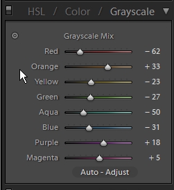
흑백변환툴로 내가생각하기에는 라이트룸2.0 이 가장 쓰기 편하고 세밀하게 변화시킬수있는것 같다.
라이트룸 GRAY툴 변환
그 후보정이란게 포토샾.라이트룸.등등... 여러가지가 있을수있으나 진정한의미의
흑백다운 흑백사진을 만들기란 여간 어려운것이 아니다.
자칫하면 사진자체를 망칠수도 있다.
여기 외국의 한블로거가 제시한 5가지 기준을 살펴보자.
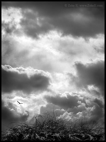
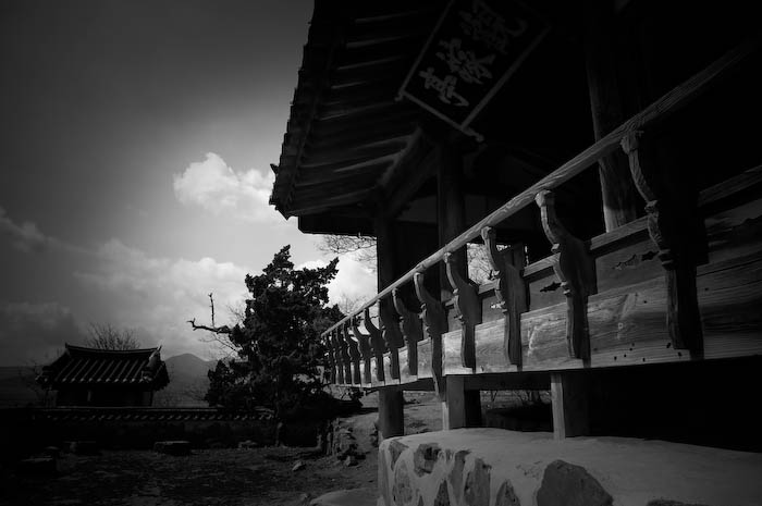
- Mood - Nothing puts a smile on a sad photograph like a splash of color. If you are hoping to convey mystery, drama, depth of thought, wet (yes - wet), ect., your image may benefit from a lack of color. A close up color portrait of a grinning clown might make you think, “Birthday Party.” The exact same image in black and white: “Serial Killer.” Which way do you want the image to be perceived?
- The Color Distracts - Which is more distracting: a nun dressed in a black and white habit or a double D sorority girl in a see-through nightie who just wants to blow off a little steam before finals? Oh, and the nightie is pink or something. You see my point? If I’m going to photograph a model in Time Square and I want you to focus on her expression, there’s a good chance the image will do what I want better in black and white.
- Time Period - The future may be in color, but the past is black and white. It’s a fact. Like it or not. Nothing was in color in the olden days. Oh, how sad the flappers must have been in the roaring twenties unable to see the orange glow of sunset as they drove past colorless trees in their Model T’s. The poor pharos of Egypt buried themselves in off white pyramids amongst heaping mounds of grey treasures. Even the dinosaurs died rather than live a life underneath a sky filled with 10 zone rainbows. Now you can transport your audience back to those bygone days with the help of desaturation.
- Intimacy - Leaving something up to your viewer’s imagination can help draw them closer both physically and emotionally. This can help create intimacy. It’s not like they’ll stand there looking at the image wondering what color that dog was, or if the man had blue eyes. More likely, with the right image, the lack of color leaves room for the viewer to step in and let their subconscious fill in the scene.
- Reality - As ironic as that sounds, what with reality usually being in color, sometimes an image can make the viewer feel more like they are really there if it is in black and white. Blame it on the heightened mood, the otherwise distracting color, the perceived time period, or increase in intimacy, but some black and white images just feel more real than their colored twin.
흑백변환툴로 내가생각하기에는 라이트룸2.0 이 가장 쓰기 편하고 세밀하게 변화시킬수있는것 같다.
라이트룸 GRAY툴 변환
'inspiration' 카테고리의 다른 글
| 여름 휴가 사진 어떻게 찍을까? (0) | 2008.06.23 |
|---|---|
| 파인아트 사진 (0) | 2008.06.14 |
| wwdc 2008 스티브 잡스 키노트 동영상 (0) | 2008.06.12 |
| 카메라 플레쉬 날개를 달았다 (0) | 2008.06.04 |
| 고유가시대 이동수단의 대안 오토바이 면허따기 (2) | 2008.05.08 |